Company Robinhood
Sector Finance, Investing, FinTech
My Role Entire design thinking process
Project Time 3 Months
About Robinhood
Mission:
Robinhood’s mission is to democratize access to the financial system.
They have built an investing platform that allows buying and selling stocks, exchange-traded funds, options, and cryptocurrencies, all commission free and offers fraction shares.
Target Market:
With more than 21 million users
Average age of 31
Positioned itself to be ideal for younger investors who want to get skin in the game even if that means in small quantities through fractional shares.
Robinhood’s overall simplicity makes the app straightforward and easy to navigate for all levels of users.
Introduction
Since I use Robinhood on a regular basis,
I was excited to take on this user research project to discover user motivations, desires, and pain points while on the mobile application. Robinhood has become a popular platform for investing and trading securities. I was curious what could make the experience even better so that users without a doubt would choose Robinhood over any other competitor.
My goal with this project was to empathize with the user and become the personal so I could identify problems and come up with creative solutions that would increase engagement, create more adoption, and lead to higher conversions from use of the application. Ultimately, what would give the user a seamless and delightful experience so they keep coming back! I wanted to take my heuristic knowledge assumptions and go out in the field and get the validation I needed.
Why I chose to do a case study on Robinhood?
As a curious cat, I wanted to discover any usability problems that could be fixed.
Through research, I was able to identify four pain points that most users were experiencing.
I then prototyped my solutions and validated them with user data.

Goals
Apply UX research methods to uncover user problems.
Generate solutions based on observable and interview data.
Synthesize data and come up with solutions to enhance the Robinhood experience.
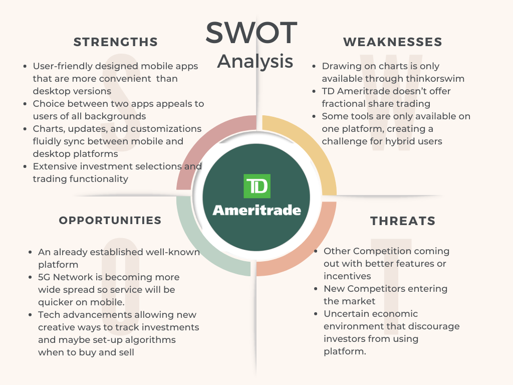
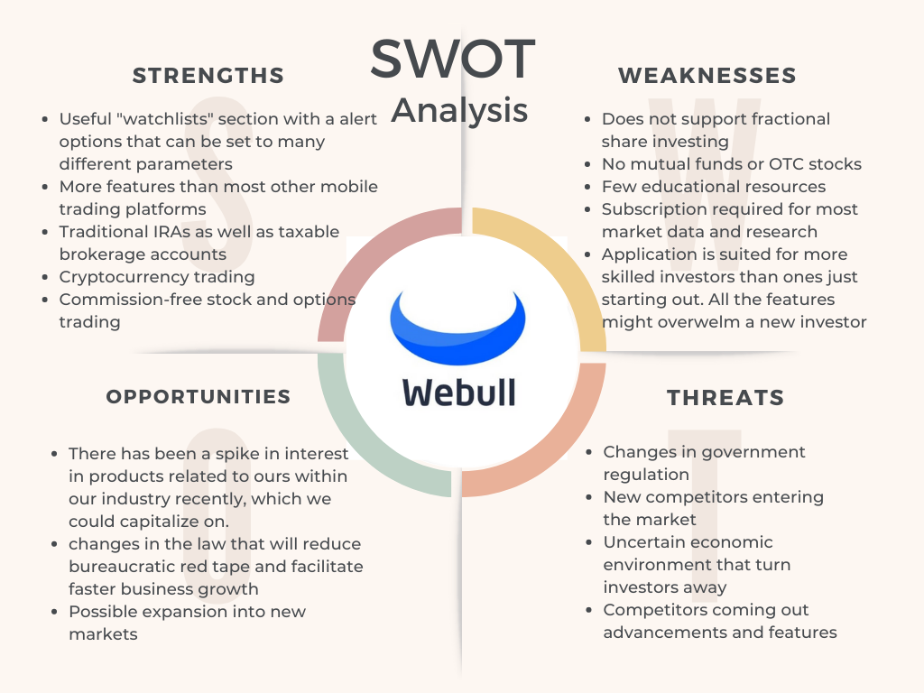
Competitor Analysis
This case study helped me to deepen my knowledge in user experience and explore a variety of methods of user research.
I began by doing a SWOT analysis breaking down the strengths, weaknesses, opportunities, and threats of Robinhood’s competitors to better understand what other services offered and what value they brought to users.
Qualitative Research
As an avid Robinhood user, I wondered what other users thought of the trading application.
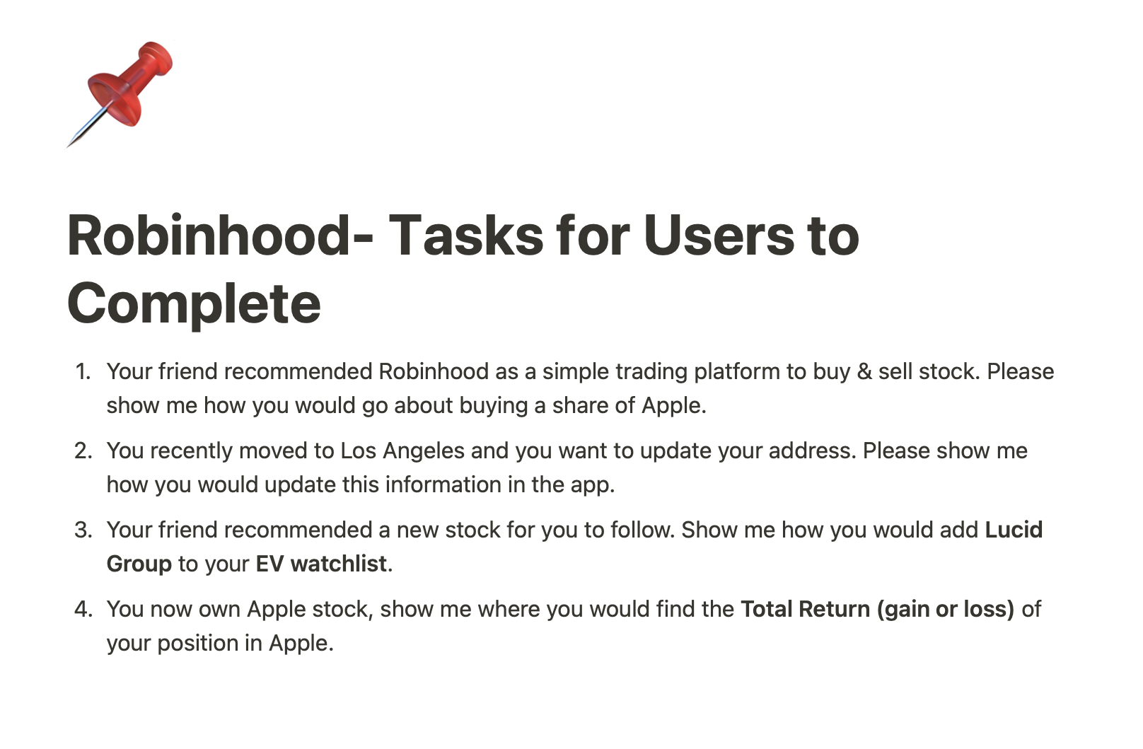
I established empathy by conducting a usability test with 5 participants. 2 of the users were new to Robinhood and 3 use the application on a regular basis. This way I could better understand the users behaviors and experience.
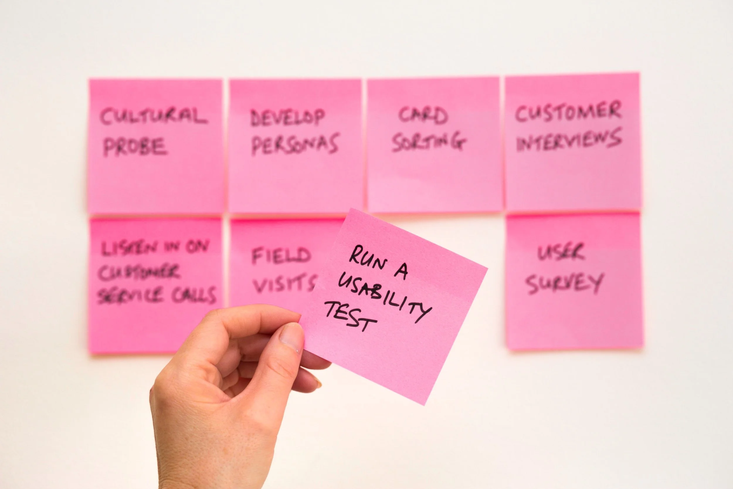
I observed how they navigated through the application and asked them to complete specific tasks to test the core functions of Robinhood.
I also asked them several interview questions to further understand their needs and identify better with the persona.
User Insights
More User Discoveries
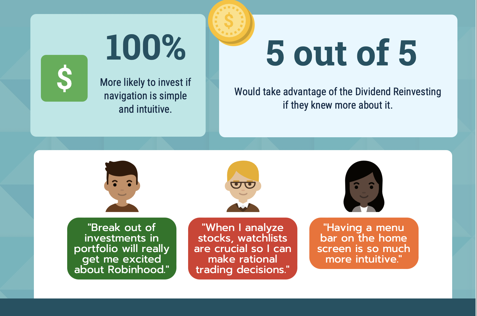
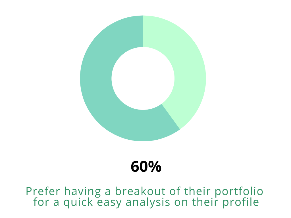
“I would use Robinhood even more if I could see an in-depth breakout of each of my investments in one place” -Robinhood User
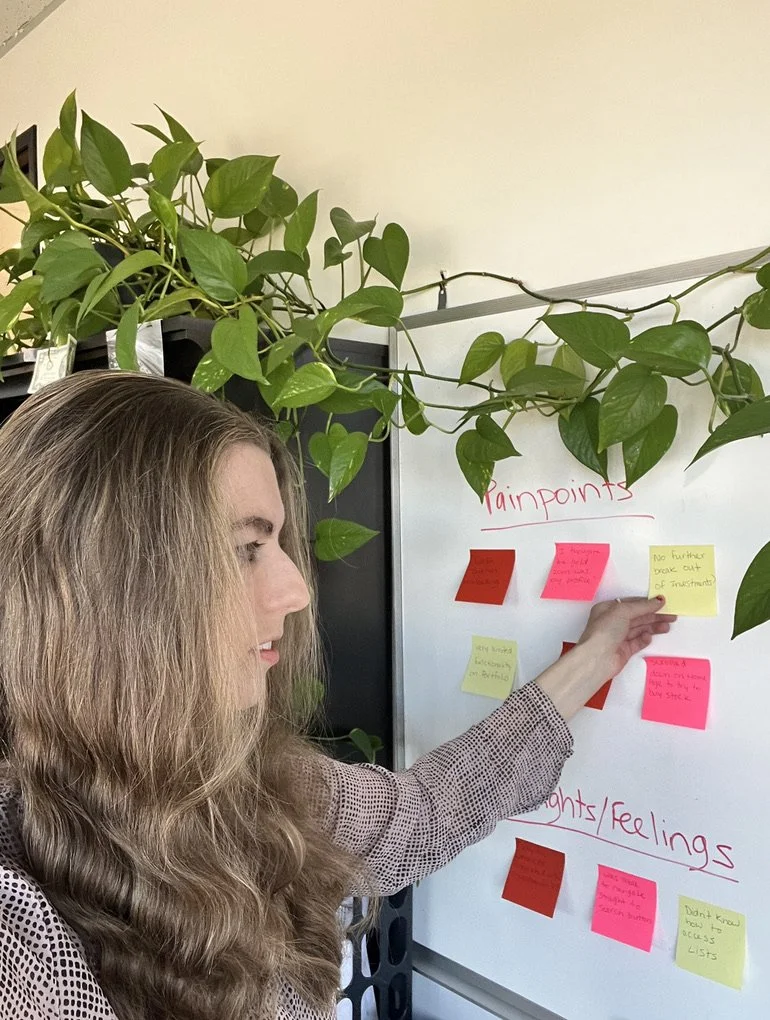
I Began synthesizing the qualitative data collected from users
on the white board.
I categorized user pain points, motivations, goals, main activities, and thoughts/feelings to better understand the user’s needs.
Persona
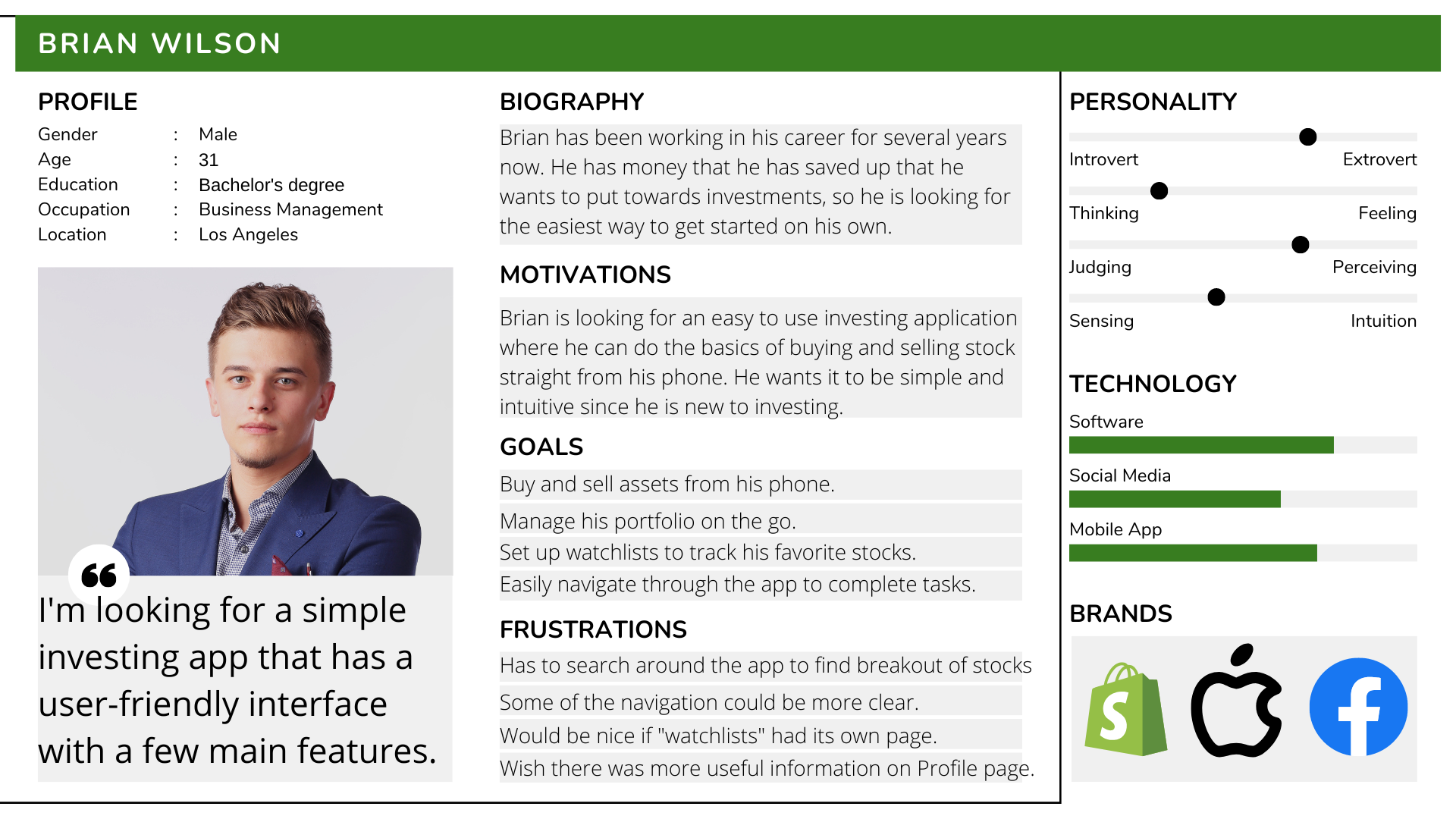
A user persona exists to understand user behaviors and needs in defining the best product/services created and what is necessary or unnecessary for them from a user-centered point of view. Therefore, I created a fictional character based on the insights I got from the user research.
Affinity Mapping
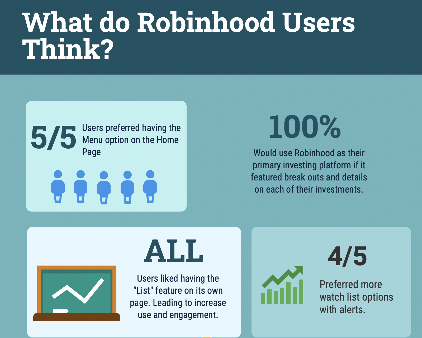
I used affinity mapping to group the pain points into similar categories on a whiteboard depending on what screen on the Robinhood application they were experiencing the friction. The pain points mainly occurred while users were on the Home screen, Menu screen, and Portfolio screen. This gave me a better picture of what the main problems were, and a clearer direction of how to find solutions.
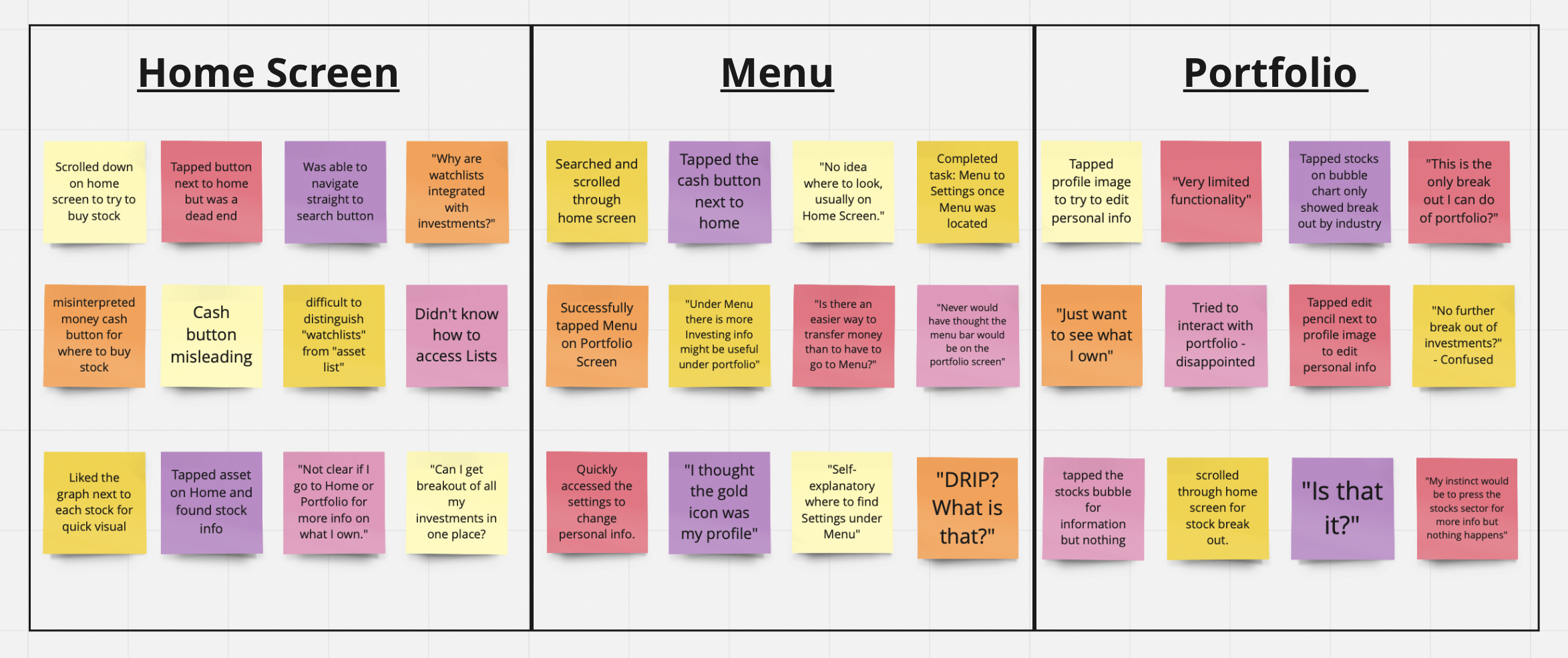

Highlights & Lowlights from Usability Testing
Highlights
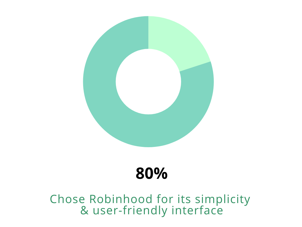
Very easy and simple to use. Basic charts and tools for beginners.
Can quickly set-up an account & transfer money all within a few steps.
Able to make a trade in seconds from mobile device.
Lowlights
Insubstantial research and educational resources available.
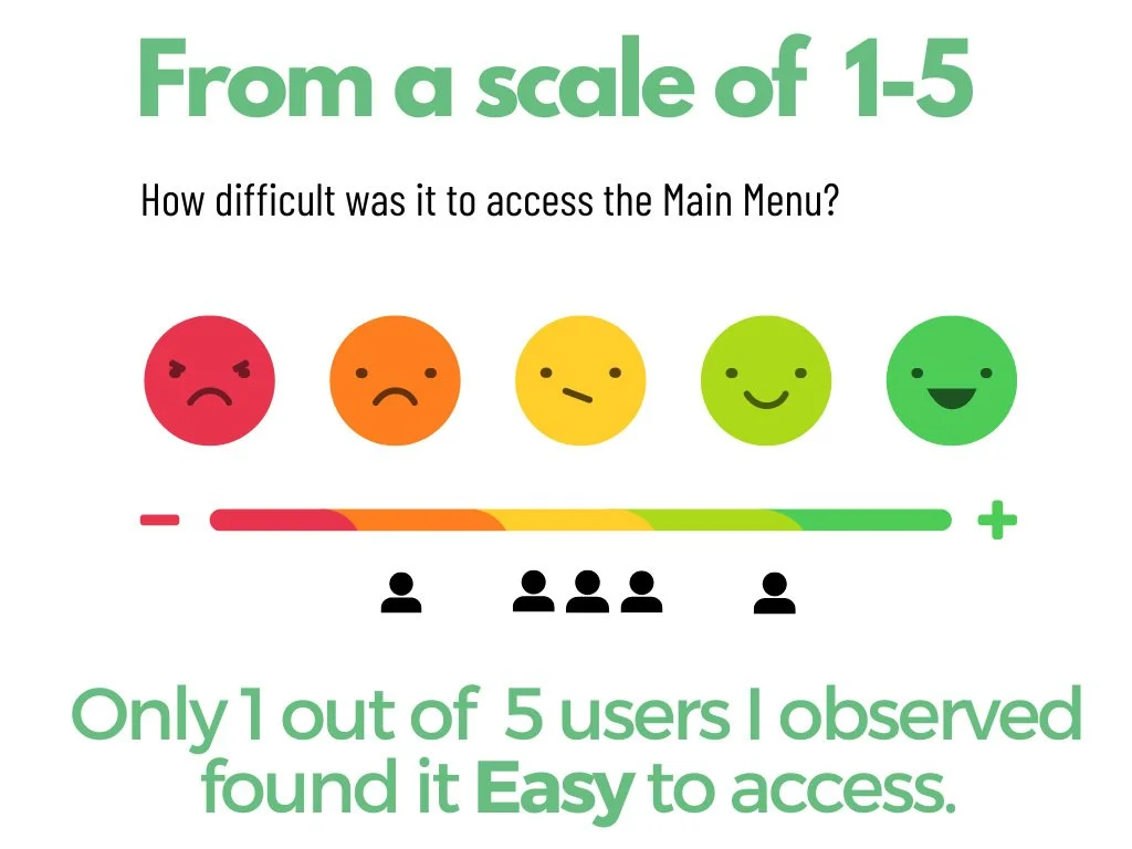
Difficult to locate Menu bar.
Hard to differentiate Investment List Vs Watch Lists.
Limited asset information in portfolio.
Problem Summary
4 problems that I will cover:
Home: No access to menu and settings
DRIP: Users unaware of feature
Portfolio: Lacking Detailed Information
Watch Lists: Blend in with Investments
Sketches
Then it came time to start ideating solutions. I began sketching ideas that could turn the lowlights into highlights. The pain points that the user’s were experiencing could be improved by adding features and signals that could be game-changer to the experience.
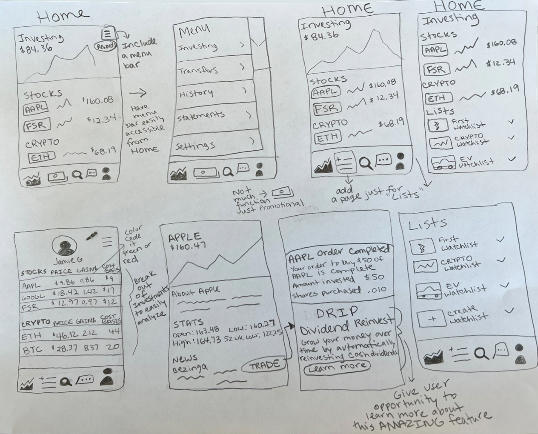
Wireframes
After I created sketches, I was ready to bring my ideas to life by creating wireframes in Figma. After many iterations, the Lo-Fi prototypes evolved into a clickable prototype that I would use for user testing. I wanted to get feedback and hear what users thought of the new changes I made to see if the juice was worth the squeeze.
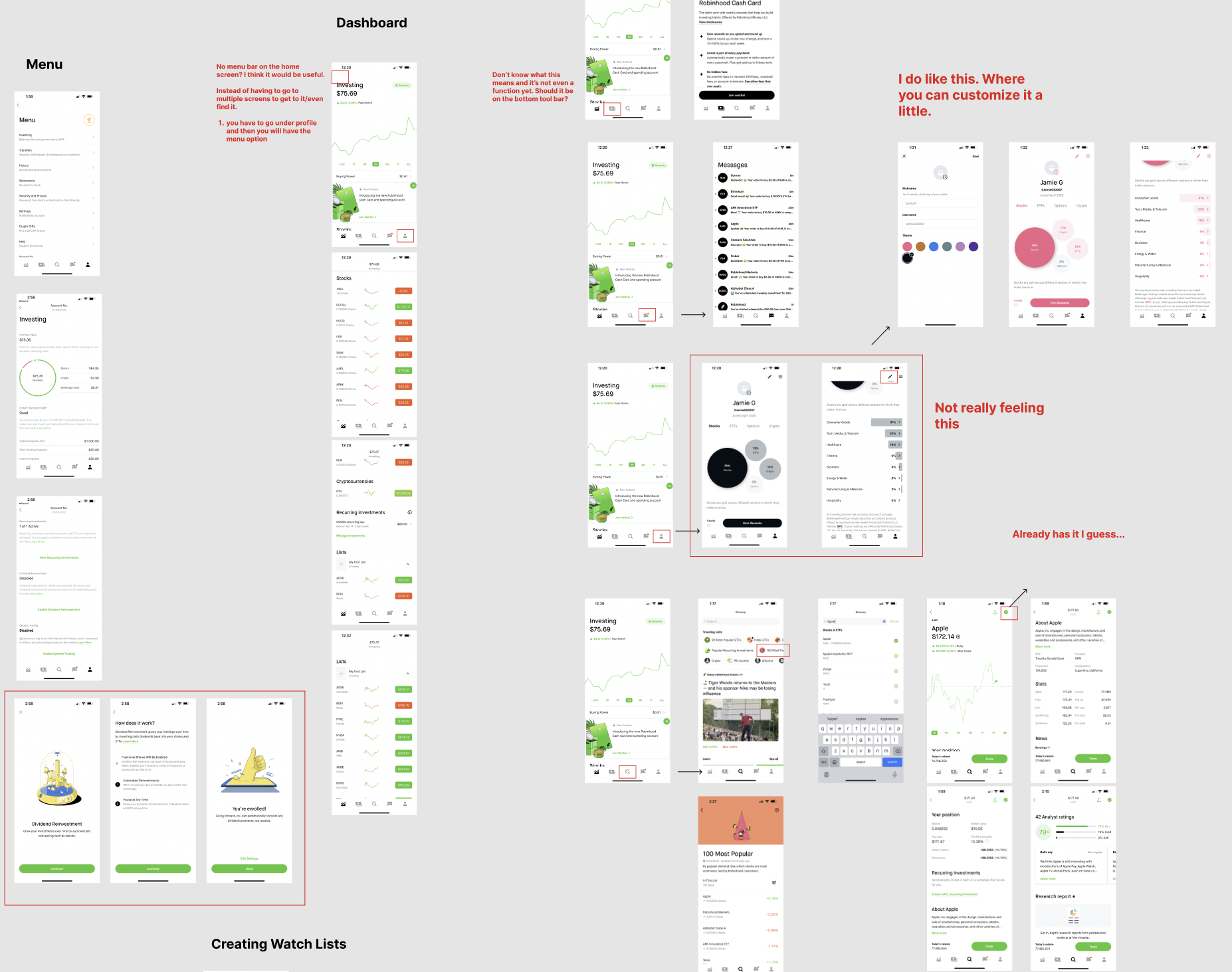
Prototypes
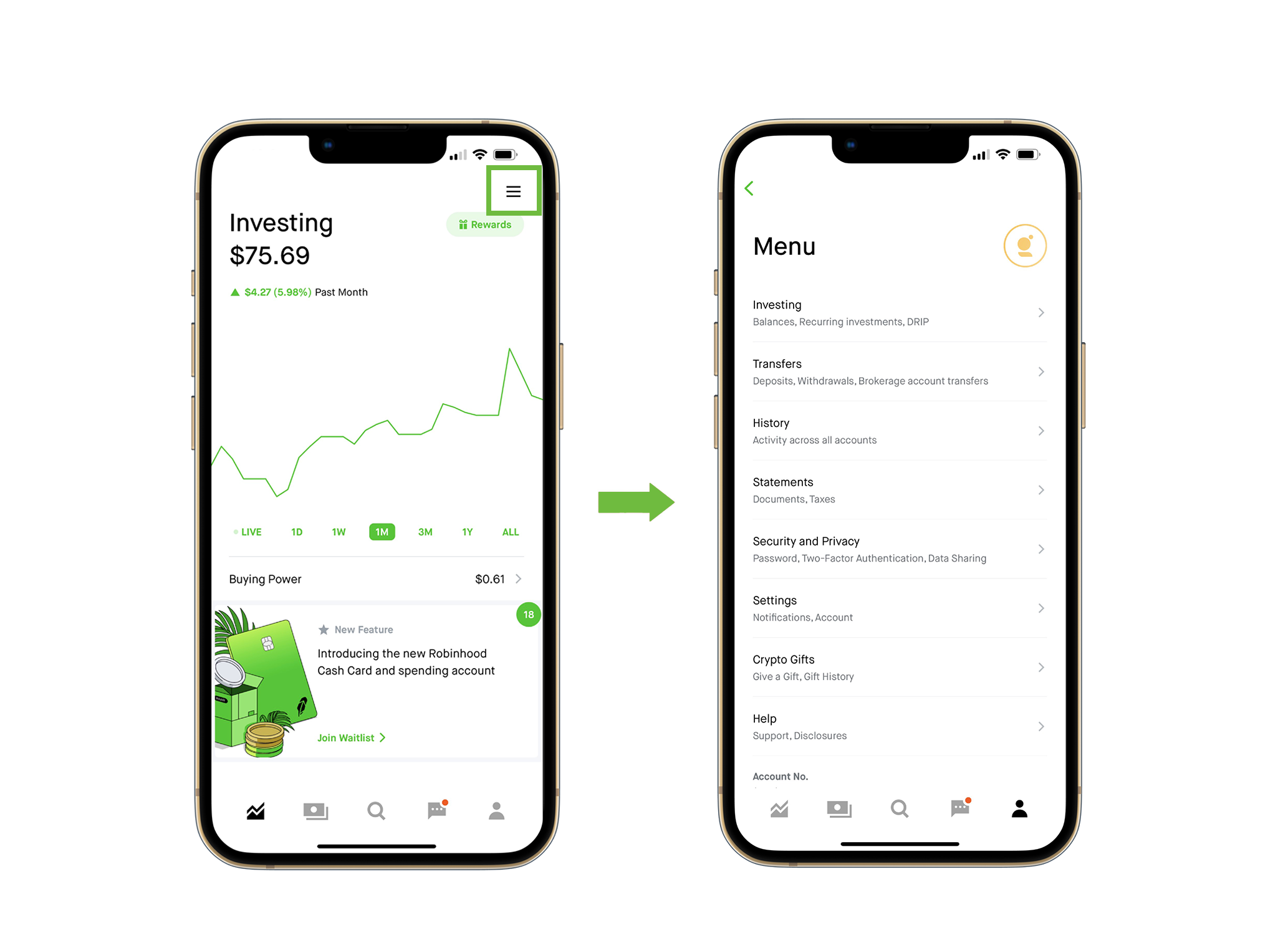
Problem: Menu
If a user wants to access the menu from the home screen, one has to take multiple steps just to get to it.
First from the Home screen, a user would have to go to their profile dashboard and then tap the hamburger in the top right corner just to access their portfolio breakout, settings, and other important information.
5 out of 5 users that I interviewed, preferred being able to access the Menu from the Home Screen.

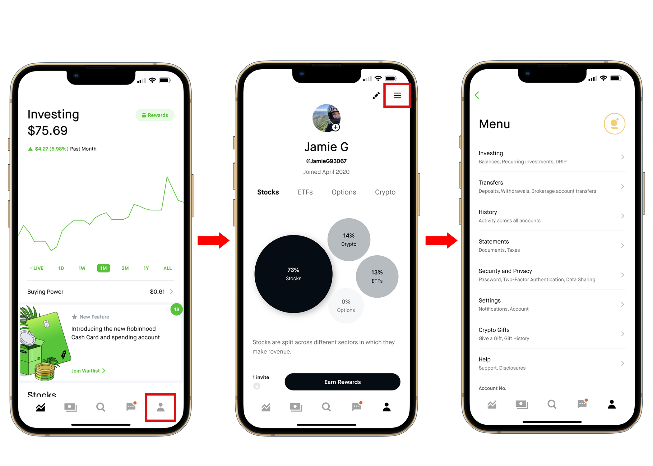
Solution: Menu
My solution so that the user can easily access the menu is to have the hamburger icon on the top right of the Home/Dashboard screen so it is apparent and can’t be missed.
This way they don’t have to search around or take multiple steps just to access settings and other important information under the main menu.
Users that I interviewed expressed how much more of an convenience it would be to have the option to access the Menu straight from the Home Screen. The hamburger makes it more intuitive since users are already familiar with the icon.

Problem: DRIP
Robinhood has this awesome feature called DRIP that needs to be showcased more.
DRIP stands for “dividend reinvestment plan” which means users can reinvest their dividends from a certain stock or ETF to buy more of that asset. Which is a cool feature that allows users to grow their investments even quicker.
However, when I interviewed users, none of them knew about DRIP or what it was. The only way to access if go to Menu and then scroll down on the investing screen. Which makes it buried and not easy to find.
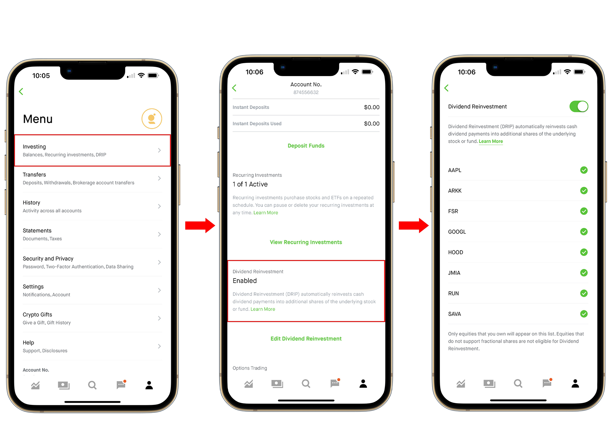
Solution: DRIP
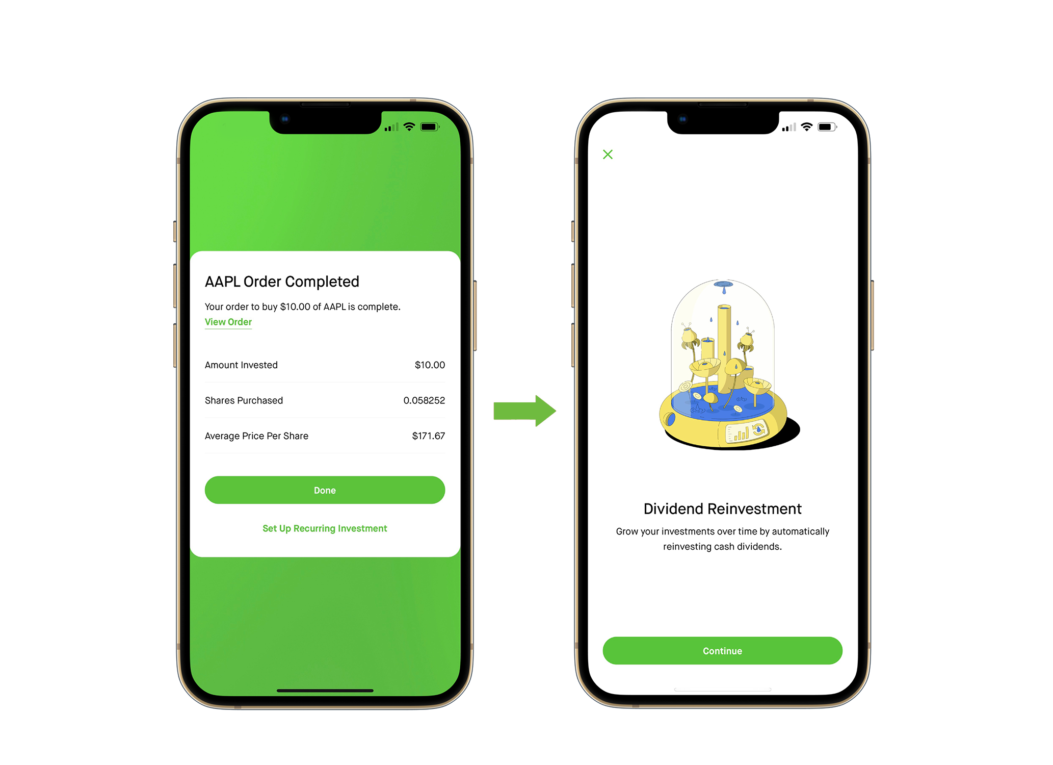
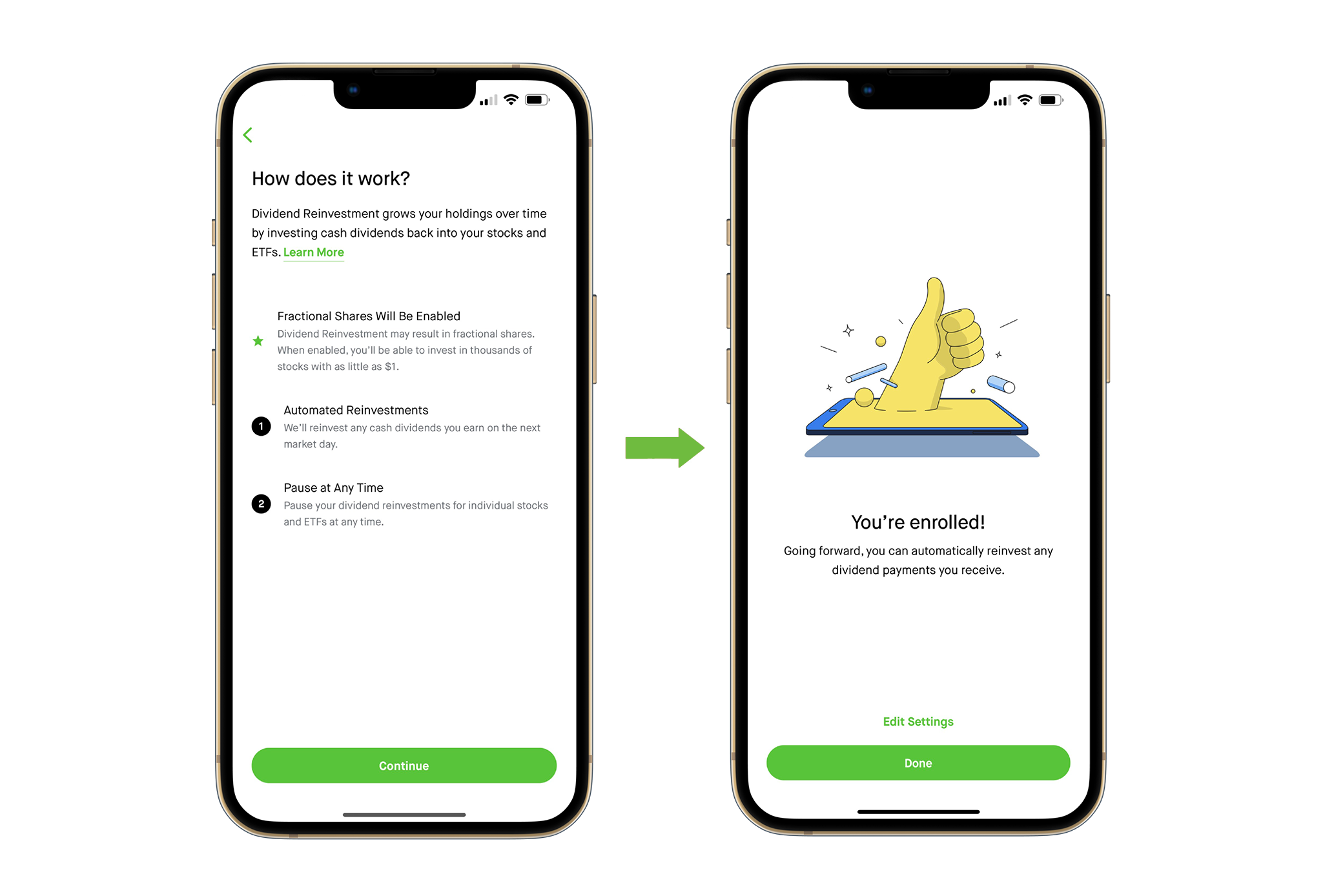
Let’s educate users right off the bat after buying any stock or ETF that has a dividend.
My idea is to have a short tutorial pop-up right after the buy order is complete. That way the user is aware of the feature and how it works with an easy step-by-step guide.
Users that I interviewed would prefer taking the time to learn about it with a quick tutorial rather than not knowing about it at all. Once they found out about it, without a doubt each one of them would take advantage of this feature for their investments that have dividends.
They got excited and wanted to use the application more since it was a great incentive to have their money grow even more.
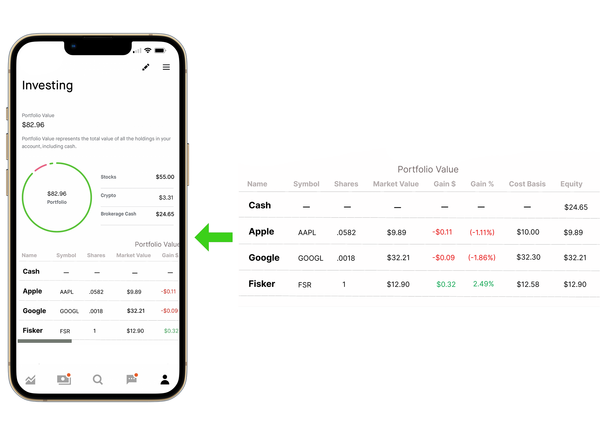
Problem: Portfolio
As an investor, it is important to have a clear breakout of your investments to better assess your holdings.
The Robinhood application does not have a clear breakout of investments on the profile screen. It just breaks it down by category and industry. That is great! But investors also need to see the status of each investment.
The insights I collected from the user testing show that when users go to their profile, they expect to see a dashboard of a breakdown of their investments by category and see how their investment is performing. What is the cost basis? Capital gains? Etc. Users are using Robinhood has their investment platform to not only buy and sell but build a portfolio.
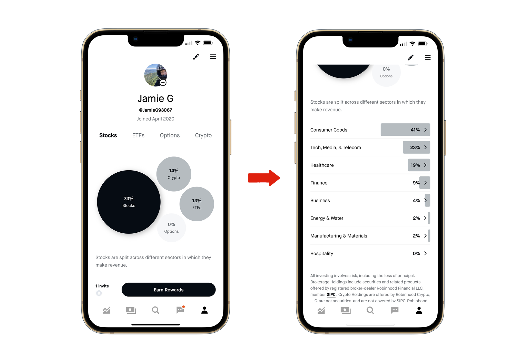
Solution: Portfolio
My solution is to offer a Portfolio Value breakdown right from the user profile screen. Under a user’s profile it should show how much is invested, what the investments are, and how much cash is available for future investments.
Users shouldn’t have to search around to find out more information about their investments.
From user data, the portfolio screen is the 2nd most accessed screen after the Home screen. So why not make it more convenient for users to see all of their investments all in one place?
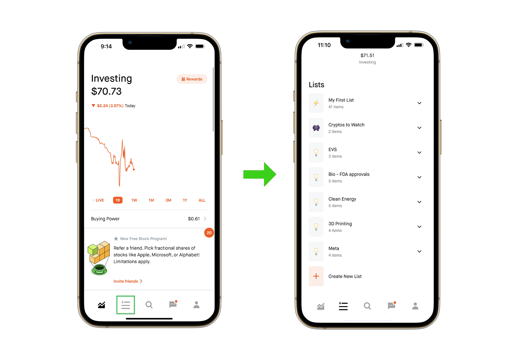
Problem: Watchlists
I asked Robinhood users if they use watch lists and how important it is for them to have them?
4/5 said that they use watch lists and 3/5 said they use watch lists on a regular basis and prefers a platform where they can easily access them.
Robinhood had access to watchlists right on the Home Page, however users must scroll down quite a ways past the investment chart overviews, after their stock and crypto investments and that can get frustrating when using the watch lists so frequently throughout the day.
Solution: Watchlists
Since more than 80% of the users I interviewed use watch lists, I thought why not give them what they want and provide an easy one tap access to all their watchlists. Where they can create and manage as many watchlists as they like.
From the Home Screen, I thought it would be easier to create a watchlist icon on the bottom bar so users can get to their watchlists in one click.
The watchlist screen would be just for all their watchlist folders so there is no hassle finding them or getting to them.